
Search Contract Jobs*
Hello!
You’re now leaving the Expedia Group careers site and will be directed to our supplier partner’s website to explore and apply for contract job opportunities with Expedia Group. The website is operated by Expedia Group’s employment partner.
*currently only offered in USA & UK
Jobs
Search Expedia Group Jobs
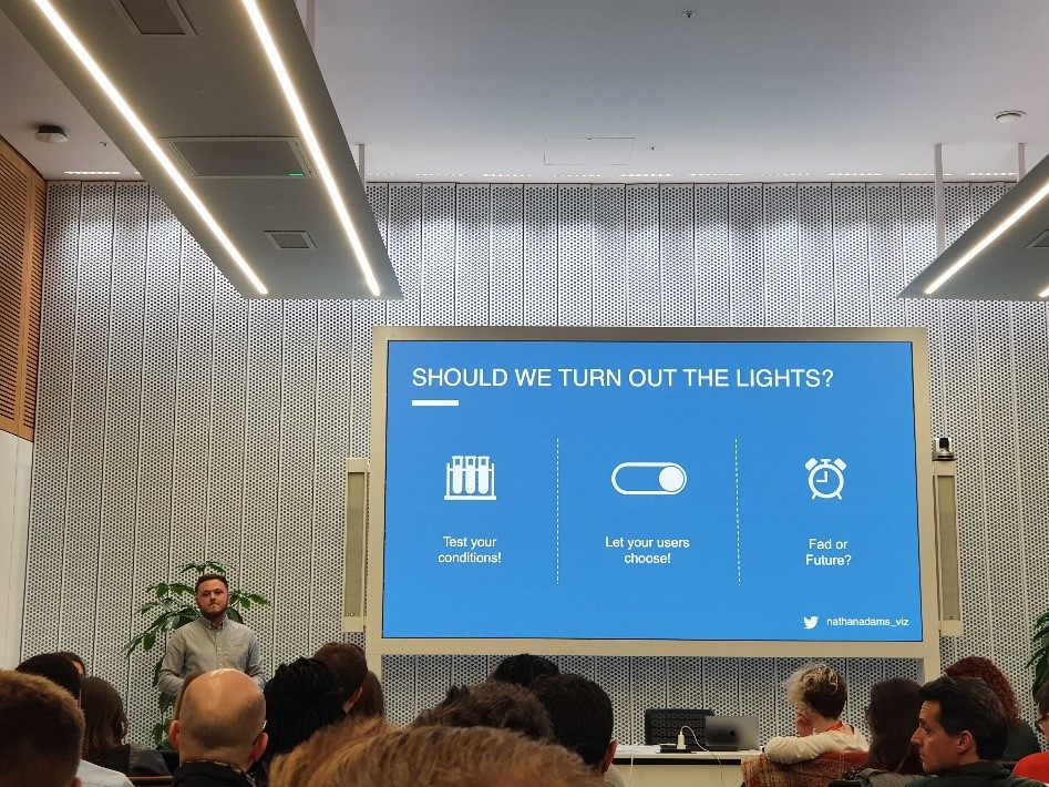
Dark Mode in Data Visualisation: Should we turn the lights out?
Nathan Adams | Senior Data Visualisation Engineer in London
Working within the Data Visualisation Centre of Excellence at Expedia Group, we are constantly innovating and researching current trends and new ideas. Recently, I had the opportunity to speak at London Tiny Tableau Talks and showcase some of my research. This event is one of many in the thriving visualisation community and focuses on lightning talks where attendees can pick up top tips, tricks and best practices.
I saw this as a great chance to connect with the external visualisation community, to network with others and to share some of my most recent findings. For this talk I decided to discuss the growing trend of ‘dark mode’ in technology applications such as laptops and mobile phones and explore the benefits, considerations and use cases within data visualisation.
This was my first time speaking at an industry event of this scale and to be honest I approached it with mixed feelings – strong excitement but also nervousness. I really enjoy that we can participate in such events as part of my full-time job at Expedia Group. The most rewarding thing was that the presentation itself went smoothly, which provoked interesting questions and some attendees approaching me to dive deeper into the subject matter over drinks.
This was more than just an exciting occasion at an external event which I believe is worth sharing, so if you are interested in learning about dark backgrounds and its application in data visualisation, then keep reading!
What is Dark Mode?
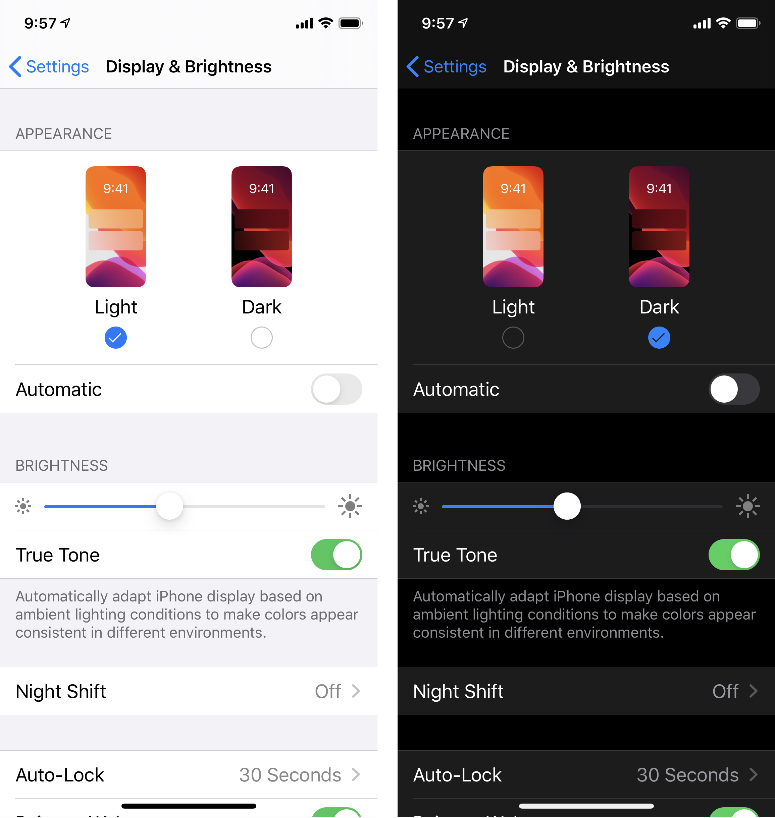
Technology companies such as Google, Microsoft and Apple are now allowing their uses to toggle to a dark mode, a capability that can switch electronic devices to a darker screen variation. This trend exploded in 2019 with Whatsapp being the most recent application to allow users to toggle.
Dark mode isn’t however a new concept and can be traced back to the times when computers were first built. Although not by design or choice, the early personal computer had a dark background with green text. It was only after technology advanced when users started to see light backgrounds on screens.

Despite becoming a trend over various platforms, dark mode has received some scepticism. The claims it reduces eye strain and fatigue, helps you sleep at night and keeps you focused have now been questioned by scientists and UX researchers online. Some specialists even suggest that dark mode may potentially be damaging or harmful to your eyes. After all, studies have concluded that the human brain is hard-wired to favour dark images on top of a bright background and can be traced back to pre-historic times, so the claimed benefits of dark background have a right to be questioned.
Researching this posted an interesting question: “Is there space for dark mode in data visualisations?”
Dark Mode in Data Visualisation
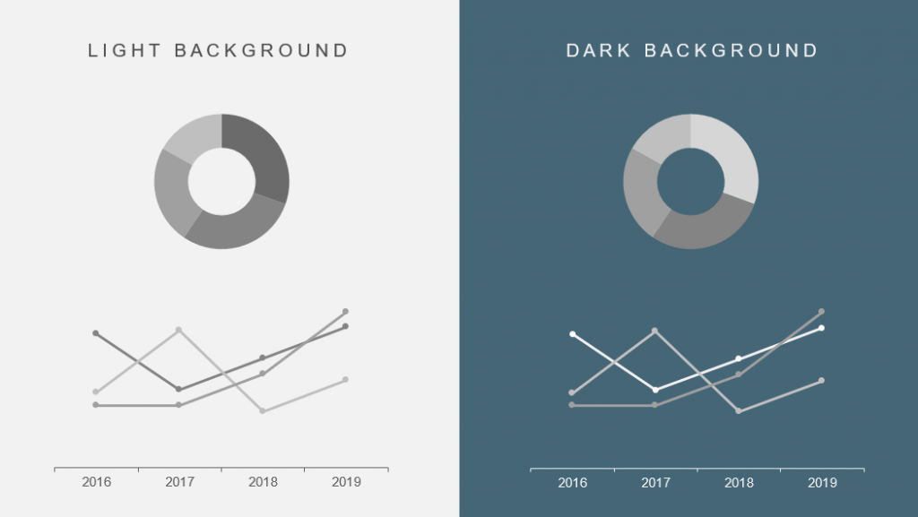
A key debate which criticises the use of dark backgrounds in visualisation is its conflict with one of the core visualisation principles: ‘Optimise the data:ink ratio’. This principle is defined as using the least amount of ink possible to display data, and that every bit of ink on the page should have meaning. One could argue that having a dark background is a hell of a lot of ink for not so much data! However, I argue that this principle does not apply to the background ink of a visualisation, simply because charts can seamlessly flow into the page due to transparency which can clearly be seen in existing examples (see image below).
Although the world of data visualisation and dark backgrounds has not been extensively studied yet, there is some evidence to extrapolate on the topic from existing UX and web research.
Low-light conditions – Dark mode is often referred to as night mode, so we can safely say (and the research also suggests) that in low-light conditions a dark background may be a good choice. Some practical examples include hospital monitors, satellite navigation and airline cockpits.
Full-screen – When displaying a visualisation on a full screen or larger display, a dark background can be a good option as it fills the entire space. Conversely, if the visualisation is not extended to full screen, the surrounding elements may be distracting to the audience. Furthermore, if the quality of the projector/screen that will display the visual is unknown, then using a dark background could be a safer choice.
Storytelling – It can be beneficial to utilise colour when telling a story as this can assist and reinforce psychological connotations and evoke emotions. Red for example, is often associated with both love and anger. This suggests that the choice of background colour can set the scene to deliver certain story/message with stronger impact. Additionally, the use of colour could also better reflect brand’s colour pallet or adhere to brand guidelines.
Faster decision making(?) – Salesforce conducted a study whereby participants were tested on a series of graphs and charts on both light and dark backgrounds. They discovered that the participants displayed faster decision making and could more accurately interpret charts in the dark variant. This suggests that dark backgrounds could be beneficial and efficient for end-user purposes.
All of the above suggest good reasons to use dark background in visualisations of data with business purposes but of course more research needs to be conducted to confirm these theories.
Let me think about it!
If you are starting to think about using dark backgrounds in visualisation, there are some considerations to take into account.
Text heavy – If a visualisation has a lot of text, or perhaps you are building an infographic with more text than data, then a dark background may not be the best option. Scientific studies have concluded that the brain reads text better when exposed to positive polarity (i.e., dark text on light background). Using negative polarity could hinder reading performance and ultimately strain the reader’s eyes.
Pure black – It is important to recognise that most dark modes found on electronic devices are not actually 100% black. This is because pure black can be hard to look at for a long time and using a dark grey or charcoal is easier on the user’s eyes. With milder dark backgrounds, one could use a wider range of colour to express elevation and depth as it is easier to see shadows on greys.
Accessibility – It is always important to keep accessibility in mind, ensuring the contrast ratio is appropriate between the foreground and the background colour for the user. There is a great online tool by WebAim (https://webaim.org/resources/contrastchecker/) which allows users to simply input hex codes and get a clearly calculated contrast ratio compliant with accessibility standards.
Handouts – Although earlier I mentioned that background doesn’t necessarily associate with ink on a page when discussing the data:ink ratio, your printer certainly will, and will use a lot of it! If you need to print for a meeting, then you best to use a light background (or at least print a light version).
So, should we turn the lights out?
That depends! A visualisation expert will test the conditions and ask themselves some design questions such as: ‘Will my visualisation be printed?’; ‘What story am I trying to tell?’ and ‘Will it be displayed on full screen mode?’. Dark backgrounds have been found to be both beneficial and harmful, dependent on the delivery conditions.
Let our users decide? If Android and Apple allow their uses to toggle, then it may be worth including toggles on visualisations. This way users would be able to switch based to their preference and their conditions. This may ultimately increase the value that visualisation brings to users and change the perception of static dashboard/report to a responsive product or application with true UX value.
Dark mode certainly is a trendy fad, but I do believe it has real-life benefits to various use cases and users. Nonetheless, aesthetically speaking a dark background with a clever colour pallet can look very sleek, and having the choice based on preferences and needs would be great for the end users.
—
Join our Talent Community
We’re looking for outstanding talent to join us on our purpose to bring the world within reach. By joining our talent community, you’ll have exclusive access to our latest opportunities, events, interview advice, and global insights from our Expedia Group leaders. Sign up now!